Pigments In Perspective
Multimedia and visual artist Corinne Tryon discusses the importance of color, even in its absence, in any form of artwork.
Words & Artwork by Corinne Tryon
The color, or lack thereof, in any form of artwork is unquestionably important in helping to express the purpose behind a piece. I’ve personally been focusing a lot on individual perspectives lately and how everyone perceives things differently and I absolutely think that the composition of your art helps portray the message you’re trying to express. The mood, tone or style of an artwork is quite often conveyed by the types of colors that are used, in tandem with the subject matter to get the artists’ point across, and I’ve definitely used that tactic in a lot of my art more recently. I have tried using bold or high contrasting colors to help illustrate certain themes or to help evoke certain feelings when viewing my pieces and I think it’s been helpful in conveying what I’m trying to communicate to the observer.
For example, my first handmade miniature piece, entitled Tiny Crash, for the D. Thomas Fine Miniatures and The Daily Mini exhibit in Yonkers, NY, BadAss Miniatures: Causing a little trouble, used extreme lighting similar to the actual accident it was inspired by, to help communicate the contrast of something seen as “seedy” or sad (crime, drug abuse) with something that is commonly attributed to being “cute” (miniatures) in an attempt to determine where these definitions commingle or blur together once they are combined. Does crime now become cute? Do minis now become seedy?
“Tiny Crash” – Multimedia Miniature Sculpture Diorama In BadAss Miniatures: Causing a little trouble, Yonkers, NY. Curated by D. Thomas Fine Miniatures and The Daily Mini. 10.25” w x 10.25” h x 13” deep (with car)
Along those same lines, my second handmade miniature, literally used a color as the main focus of the work. My piece for the Mending Art Exhibit at The Hartford Artspace curated by Amy Smith of Mental Health Connecticut, I decided to name Blue. Having personal connections to the mission behind the exhibit, I created the piece based on what I have experienced, as well as what I picture other artists going through while creating amidst mental health issues. This piece displayed someone going through their “blue period,” which was communicated through the physical color blue throughout the whole piece, as well as all of the other messy, disheveled surroundings, usually associated with those suffering with mental health issues.
“Blue” – Multimedia Miniature Sculpture Vignette
In Mending Art Exhibit at Hartford ArtSpace, Hartford, CT
Curated by Amy Smith from Mental Health Connecticut
3” deep x 5” wide x 6.5” high
As well as using color to suggest heavy underlying themes, sometimes it can be helpful in just creating ambiance for your focus of attention. In a piece I did for a friend, that I never really named – I just keep calling “The Horror Shelf,” it was imperative for me that all of the lighting be red. Passion, love, or anger can all be suggested through the color red and all of those feelings are associated with the horror books or movies depicted in the piece, so it was very important that the lighting helped support those subjects.
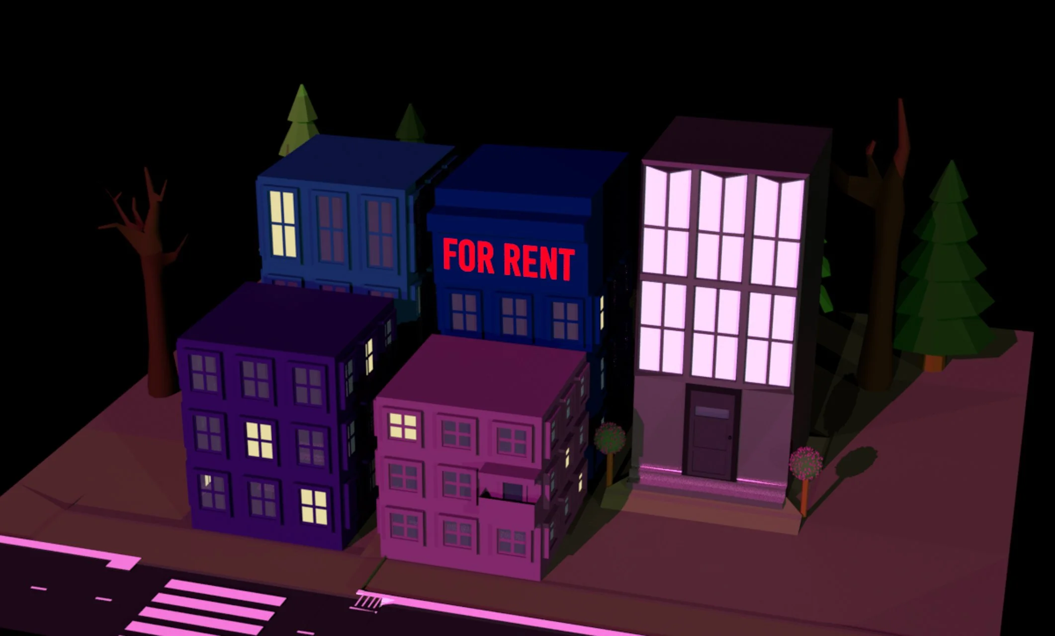
The use of color in my digital works is just as important as the use of color in my tangible, physical works. A lot of my digital art/video art and 3D renders use high contrasts of light, dark or bright colors to convey certain ideas or perspectives as well. In Mouth Breather, Martini Room, Endless Structure, Cheeks 3.0, For Rent, and Be Careful What You Wish For, color choice played a huge role in each piece and what it was trying to communicate.
“The Horror Shelf” Multimedia Miniature Sculpture Piece. Private Commission. About 2.5” w x 3.5” h x 1.5” deep.
“Be Careful What You Wish For” Multimedia Miniature Sculpture Set and Video Art (handmade pieces and purchased pieces). 12” wide x 9” high x 12” deep.
Corinne Tryon is a multimedia and visual artist. Learn more about her and see more of her work through her website at tryoncorinne.com. Follow her on instagram for her latest works @tryoncorinne.


